Kelli Carpenter and Gregg Kaminsky started R Family Vacations in 2003. The company originally catered to families looking for exciting, LGBTQ+ inclusive destinations, but over the years, they began offering adult-only trips as well. This created the need for updated branding that reflected the full scope of their services.
Because Gregg and Kelli attend most of the vacations with their guests, their names are synonymous with their services, and they wanted to keep that personal touch in the new branding. We led a brainstorming session with Kelli and Gregg, the Boombox team, and several of R Family’s stakeholders. The fruitful session provided them with several different directions they could go, including one that still featured their names.
Once they chose the name, we were tasked with creating refreshed logos for their three interconnected brands: R Family Vacations, Kelli Gregg Travel, and Out In. The concept was to craft logos that were cohesive when shown together, but which maintained unique identifying qualities for each sub-brand. They wanted the logos to feel friendly and fun.
We created unified — but unique — identities for a family vacation brand, an adult-only travel brand, and an LGBTQ+ adventure brand.
R Family Vacations is a family brand, and we made sure the logo brought the fun right away. The whimsical font from the Kelli Greg “KG”’ this time spells out “R Family,” making them instantly recognizable as related-but-distinct brands. Another playful arrow designed into the R continues that sense of forward movement, and the colorful rectangle enclosing the “R” uses rounded corners for a softer, more youthful energy.
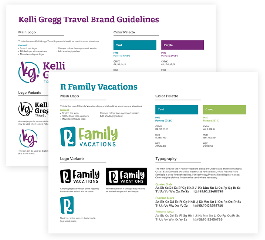
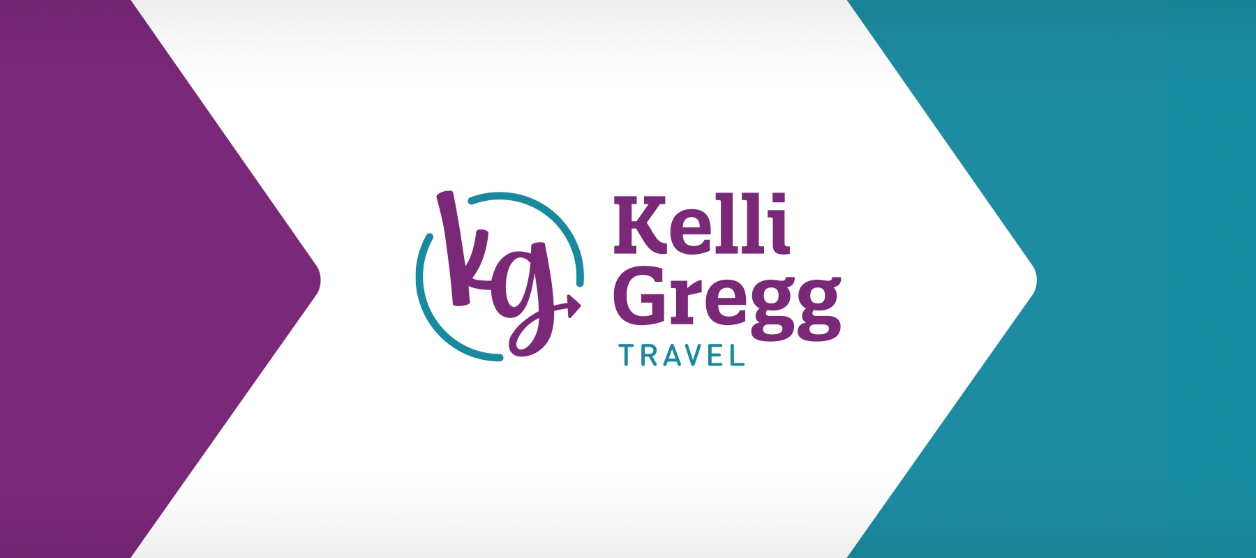
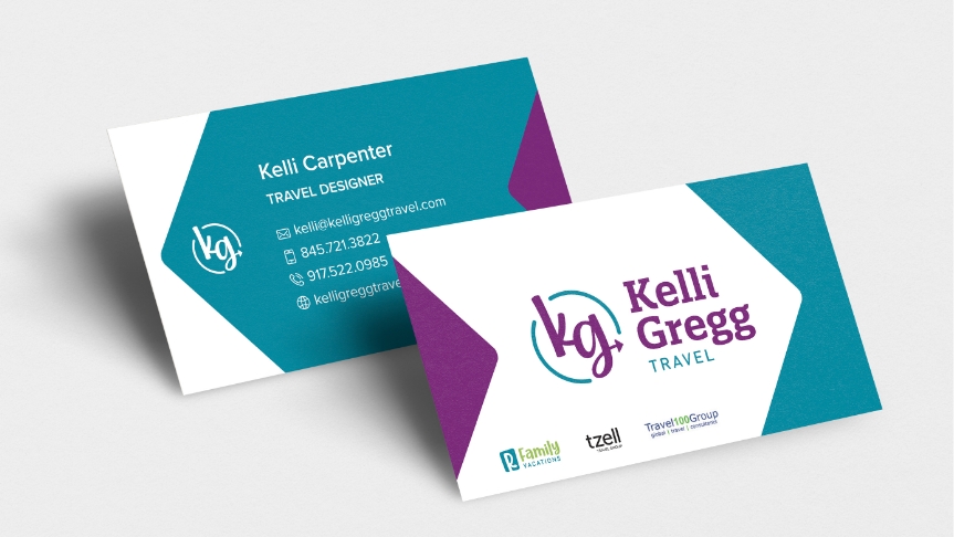
Because it is specifically catered to adults, Kelli Gregg Travel called for a more refined look than R Family Vacations and Out In. The new logo retains the fun and friendly tone Kelli Gregg has always been known for through its use of bold colors and movement. The “KG” abbreviation appears in a playful font, with an arrow curling from the “G” signaling that Kelli Gregg is always pointing you in the right direction. At the same time, the slab serif font used on the full brand name adds a touch of sophistication.
The Out In logo builds on elements from both Kelli Gregg Travel and R Family Vacations, carrying over the rounded box and the whimsical swirling font. Another directional arrow in the “T” points toward featured locations and further establishes visual cohesion among the three brands.
Because each brand caters to different audiences, we were challenged with creating a special color story for each, while also ensuring they were still recognizable as one brand family. Our solution was to use one consistent color throughout the logos—a rich, vibrant teal—which is complemented by colors that capture the unique energy and tone of the sub-brands.
Kelli Gregg Travel’s logo now features a deep purple alongside the teal to deliver the smooth and calm finish adult travelers will be looking for. R Family Vacations uses the same teal color with bright green accents, creating a finished product that exudes youthful energy and excitement. Out In’s logo pops with a radiant orange that is also used in conjunction with the unifying teal.